Allianz CommercialMy Allianz Commercial2024
Three Modules – One Vision
- Timeline
- Jun – Sep 2024
- Role
- UX design, prototyping, user testing, user interviews
- Tools
- Figma, Zoom, Miro
TL;DR
My Allianz Commercial is a platform for large corporations that consolidates data from three complex modules (Programs, Claims and Risk Engineering), giving clients and brokers access to multiple lines of business in one place.
Challenge
From many requirements to one dashboard
The challenge was to design a dashboard that brings key data from three modules into a single, accessible view. It had to work both as a quick entry point to each module and as a place for the most relevant statistics, tailored to the user’s access level and line of business.
The biggest hurdle was aligning requirements from the project owners of all three modules and agreeing on which information to include, so the dashboard stayed insightful without overwhelming users with data.
Solution
Adaptive dashboard content
I developed the display logic for module widgets so users only see relevant content. Widget visibility depends on three factors:
- data availability,
- the user’s access to the line of business,
- the user’s access rights to each module.
User testing
Putting the dashboard to the test
After designing the dashboard, I ran user testing sessions with client coordinators and brokers with different module access, to make sure the layout, navigation and statistics were clear, relevant and actionable.
It’s really positive, especially my first impression of the map, where you can get a good overview.
General evaluation
Overall, the dashboard received very positive feedback: all respondents agreed that the amount of information and its level of detail were appropriate.

Deep dive
What we learned, widget by widget
Navigation
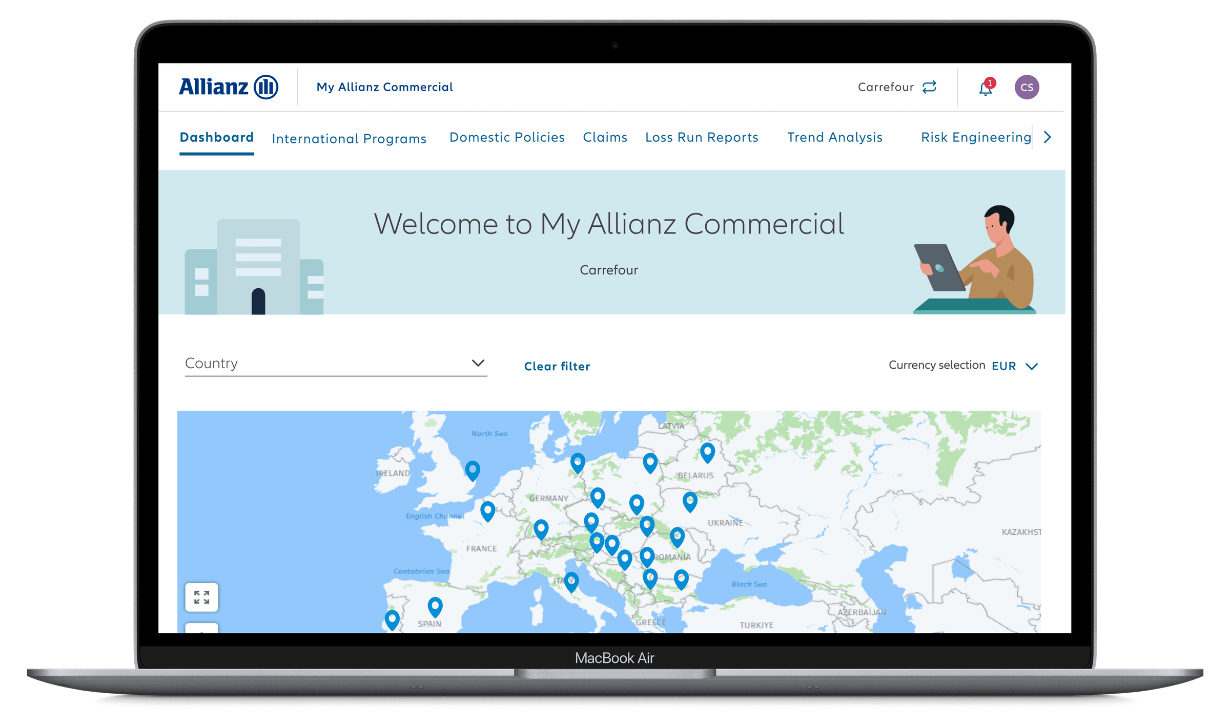
Most participants highlighted the map as a useful overview of locations. Several appreciated the country selector for faster access to data, though most preferred zooming in on the map. No one used the currency dropdown.
It’s easier to find policies on the dashboard. Right now we have to move around the page quite a lot.
Programs widget
Participants responded positively to the Programs widget, though those with fewer programs felt it was unnecessary. The split by business line was seen as interesting but not essential, and some suggested clarifying the information on premium types.

Before
Programs widget

After
With year filter and implementation status
Claims widget
Participants highlighted the importance of time context, particularly for the Claims widget, and wanted to see claims by policy country directly on the dashboard.

Before
Claims widget

After
With year filter and claims per country
Outcome
An award-winning platform
The My Allianz Commercial (MAC) platform received the “Best Digital Transformation Initiative” award at the Global OPEX and Business Transformation Awards in 2024. The award recognises the platform’s innovative approach to operational excellence and business transformation in the insurance industry.